The Babe’s Room
Our baby is due any day, and I feel a flurry of emotions. It is hard waiting. In the mean time, though, I thought I’d share a few pictures from his room. We have some art and a mobile to hang up, but otherwise it is more or less ready for him.
At first, designing a baby’s room was a little challenging. I wanted the room to fit with the rest of the general scheme for our house, but I also wanted it to reflect that it is a child’s room. I looked at a lot of nursery ideas on Pinterest to gather ideas.
I started down the trail of a Stars and Ships type nursery, and I definitely drew a lot of inspiration from that concept. However, I decided against a strong theme. There is nothing wrong with themes, but they just don’t quite fit my style. The base colors for the room ended up being black and white, which is very consistent with the rest of our house. Dylan and I also found a few pictures of ships and sail boats from Goodwill when we were there one day. I’d like to add a few constellation prints into the mix as well. Also, I’m in love with this adorable print of the world with animals in place of the continents.
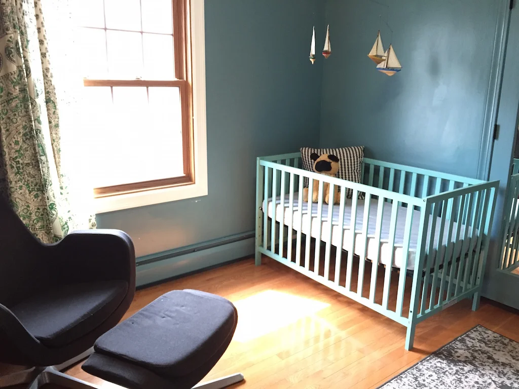
My main direction for the room came from the curtain. I got it from a local vintage store a long time ago and already had it hanging in the room. I could have tried to find another spot for it, but it fits the window perfectly. I figured kelly green is a good color for a boy.
Picking the wall color was the hardest part. I went back and forth on using a mint green, but I just couldn’t convince myself that it would work. The room has a strong southern exposure, and with the wood floor, it tends to pull yellow. I was afraid that the mint green would just look sickly and yellowish. After picking out a lot of colors at Home Depot, I landed on Behr’s Bayside. I was really drawn to the depth of the color, and it was a great blue-green that I thought would complement well with the kelly green in the curtain. It ended up being a great choice, and I’m happy with how it turned out.
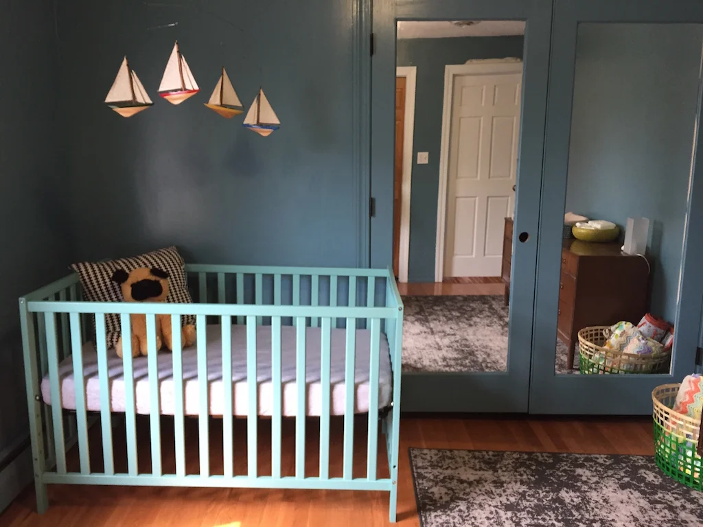
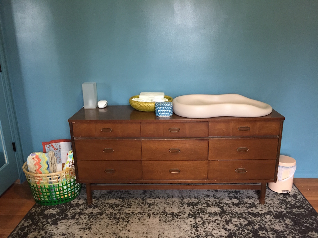
Most of the other pieces for the room came from other areas of our house or from family. The dresser is from my parents, the chair was in our bedroom, and the rug had been in our living room for a long time before being displaced.
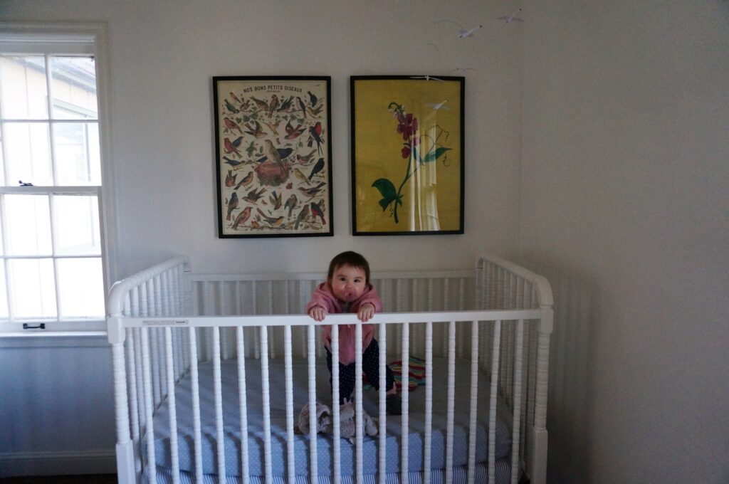
The crib is a funny story. We originally got a crib from our neighbors, who were giving theirs away one day. We distinctly remember them assuring us that it had all the pieces. Well, a few weeks ago when Dylan went to put it together, it was obviously missing some key pieces (i.e. the bars that hold the mattress in place). In researching if we could find replacement parts, I learned that drop side cribs were recalled a few years ago…and realized this crib was a drop side crib. So, after a few tears, I turned to Amazon for a crib that was not crazy expensive but still cute. I decided on this one in lagoon. I really wanted to get the one in yellow, but it just didn’t work with everything I already had in the room. The lagoon works well in the room, though, so it was worth it.
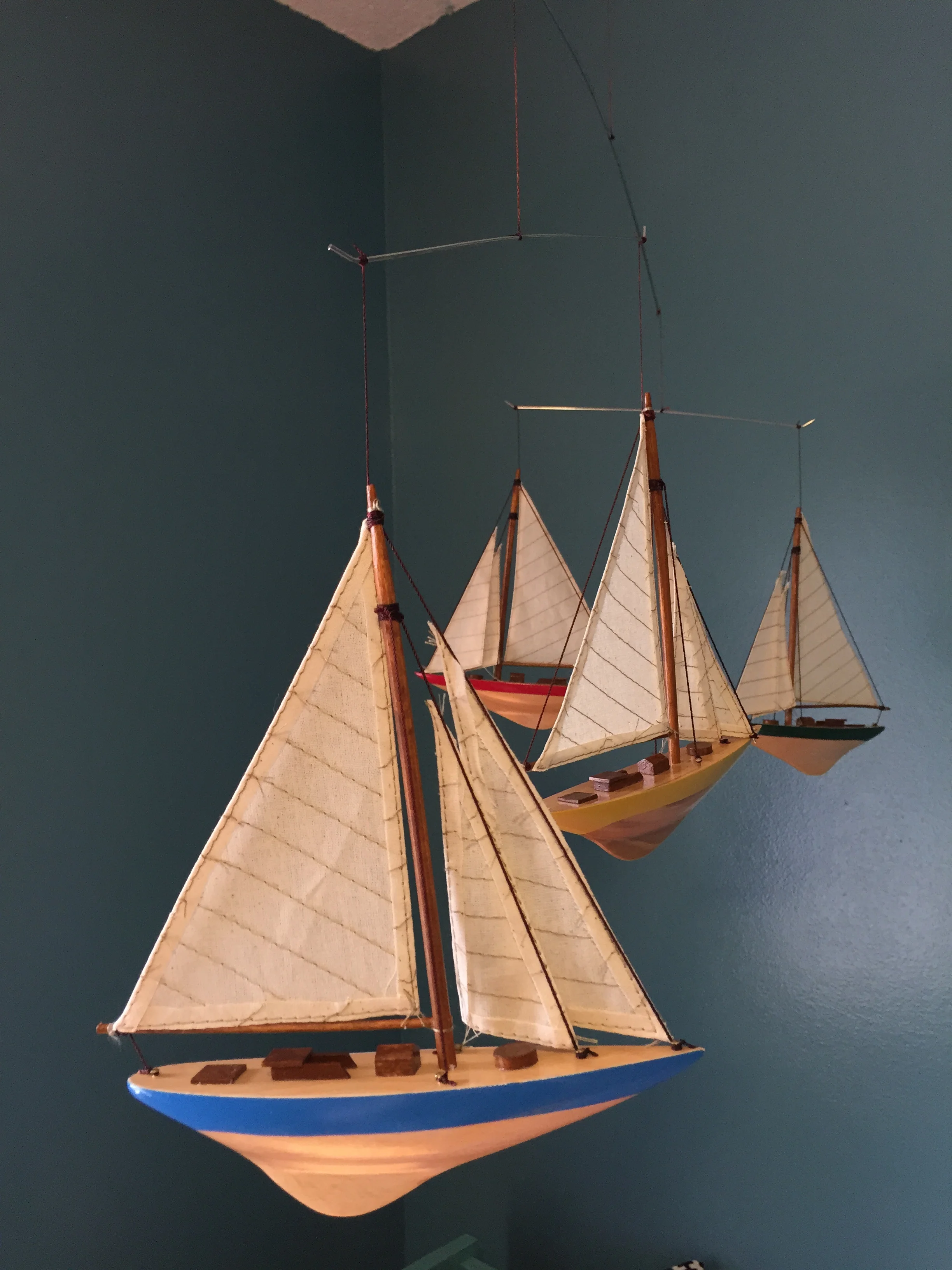
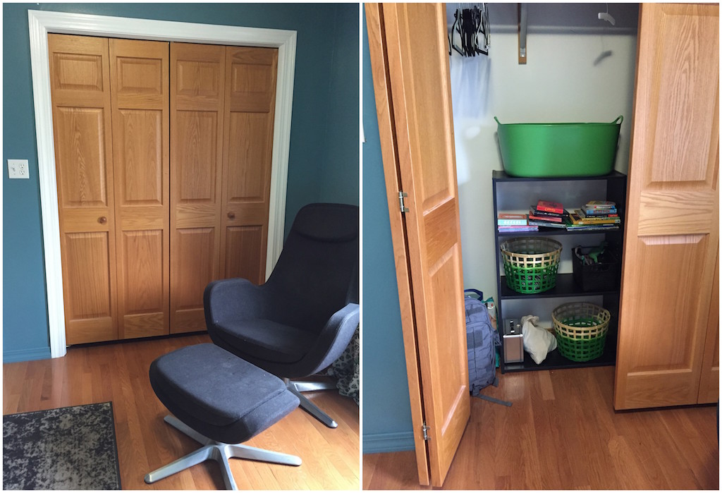
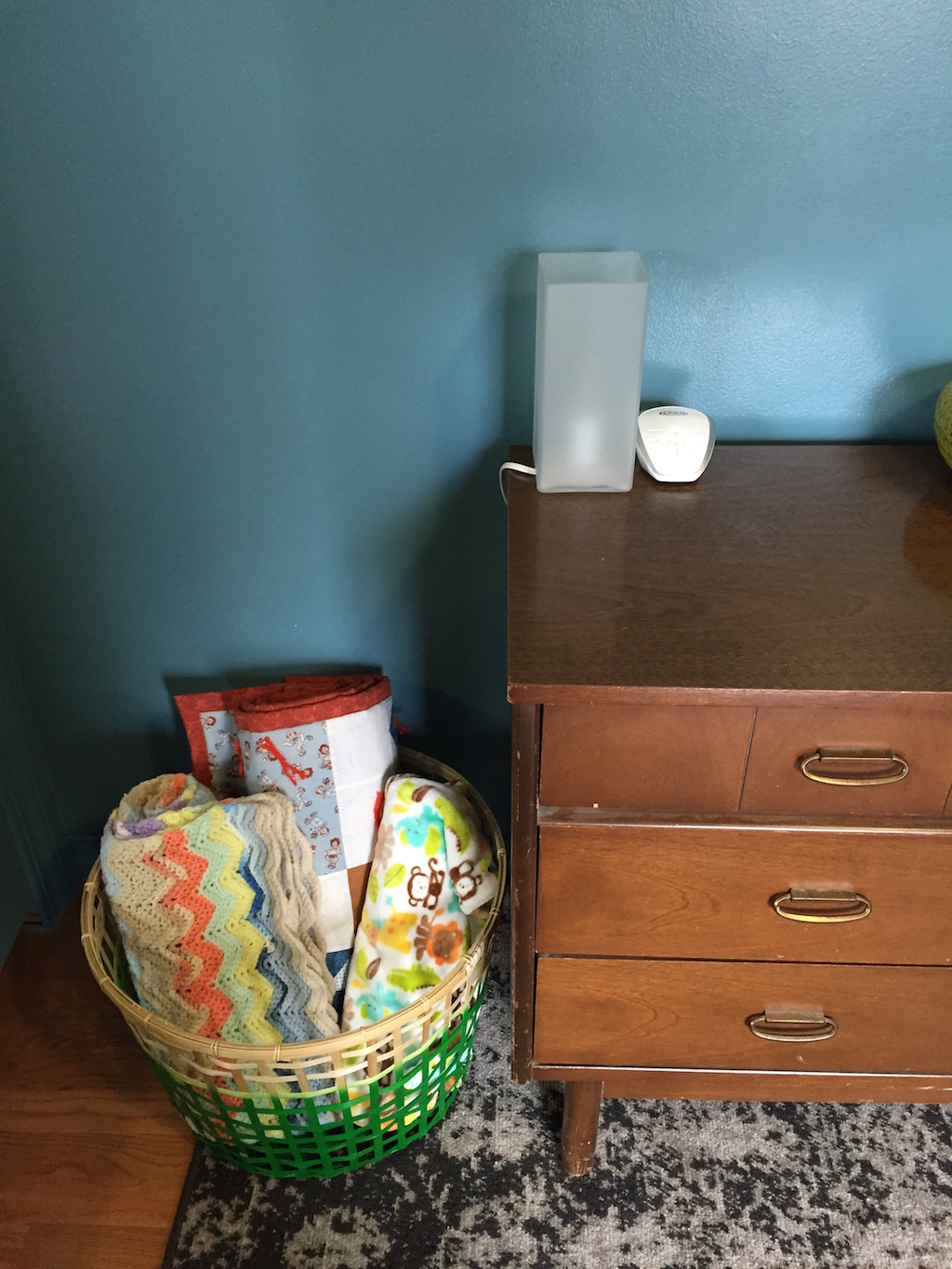
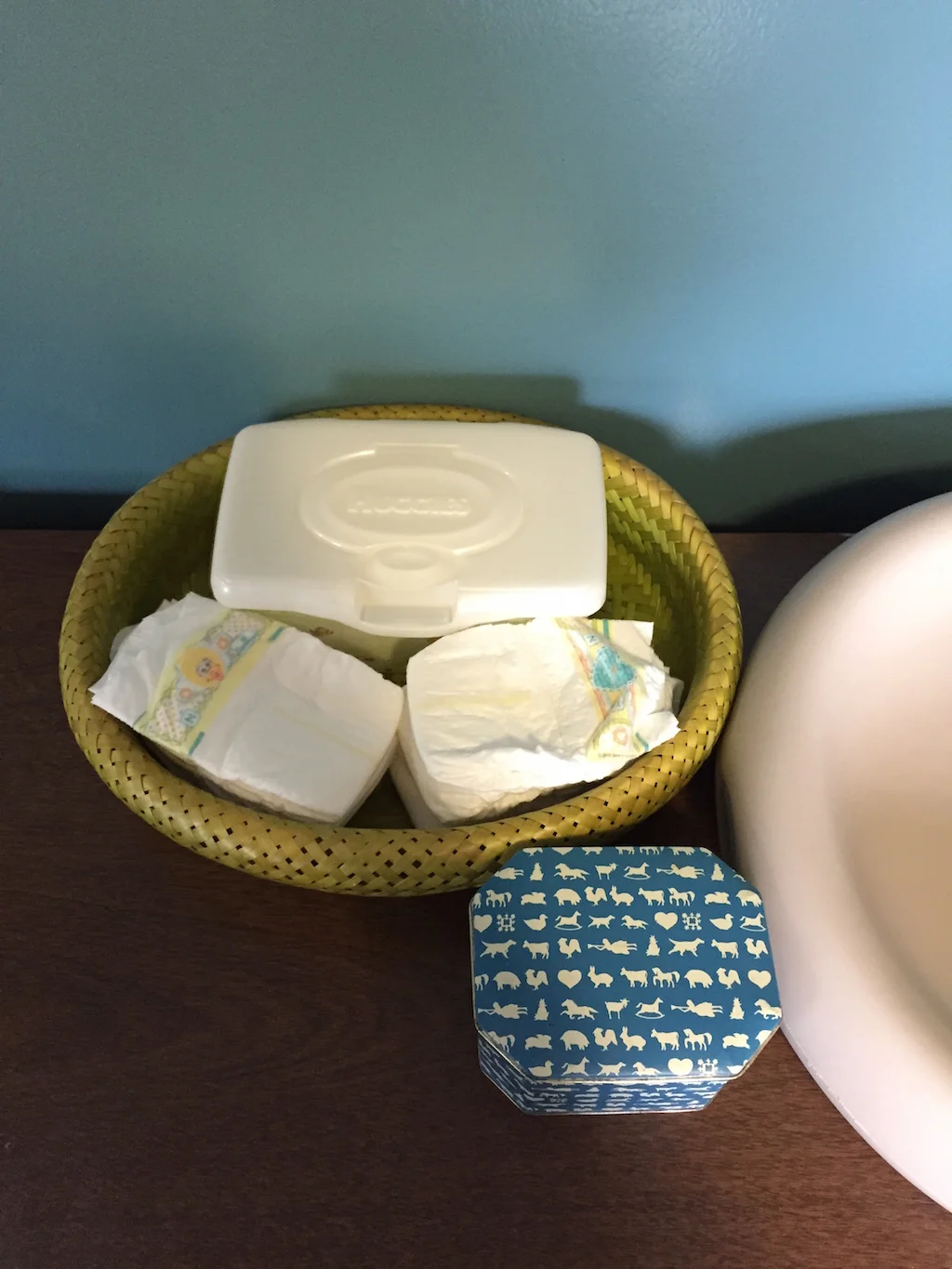
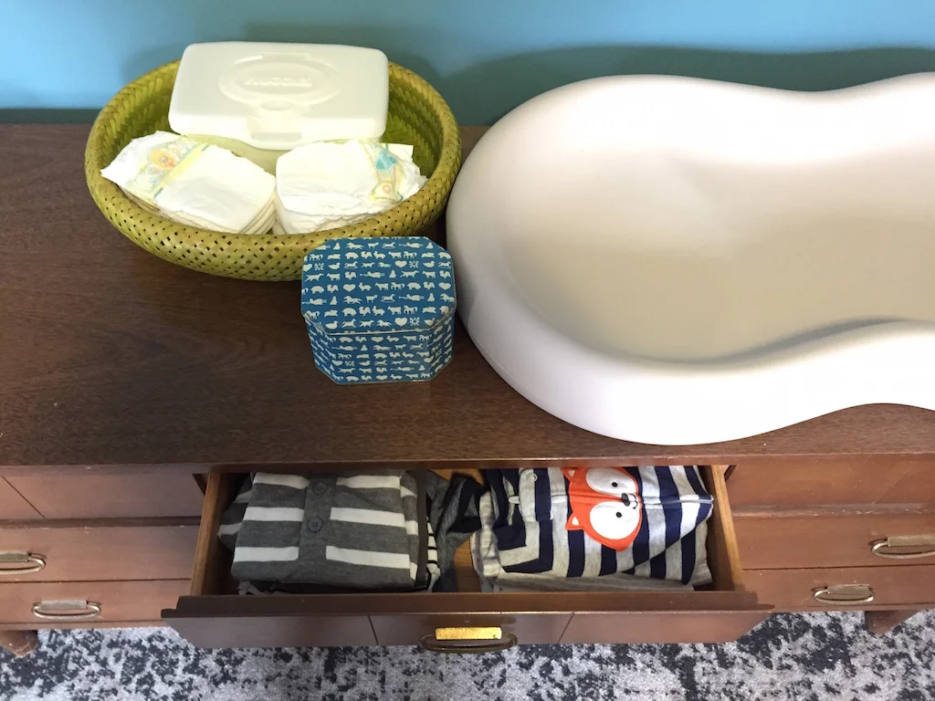
The green-dipped basket beside the dresser and the two in the closet are from Ikea. The mobile is from Amazon. The changing pad is by Keekaroo from Amazon. It was a little pricey, but I’m really impressed with its quality. It is a squishy plastic that can be wiped off easily if it gets dirty…rather than having to be run through the washing machine like a cloth cover. The diaper basket and blue tin are vintage (from Goodwill and my grandma, respectively).
Thanks for taking a little tour of the space! It has been fun to see it come together, and I’m looking forward to getting the rest of the art up on the walls.
